
DaVita Patient Portal
Expanded the patient portal to mobile, improving accessibility and flexibility for clinical teams
Role: Lead Product Designer
Date: Sketch, InVision, Sympli
The Problem
The DaVita Patient Portal was designed for desktop, but teammates were increasingly accessing it on mobile devices in real-world clinical settings.
This created usability issues, inconsistent experiences, and limited accessibility for users who needed to move between clinics and work on the go.
The challenge was to bring a complex, desktop-first application to mobile while preserving core functionality and usability.
Why this was challenging
No standardized device ecosystem across the organization
Wide range of phones and tablets in use
Desktop workflows not optimized for smaller screens
Need to determine which functionality should be retained, adapted, or removed
High volume of screens and interactions to redesign
Approach
I partnered with a business analyst to define a scalable mobile strategy.
Key decisions:
Identified core functionality that needed to be preserved for mobile use
Established responsive breakpoints to support a wide range of devices
Designed for flexibility across unknown device types
Breakpoint Strategy:
1280px+ — Desktop
768px+ — Tablet
576px+ — Mobile
These breakpoints provided coverage across most devices despite the lack of standardization.
Solution
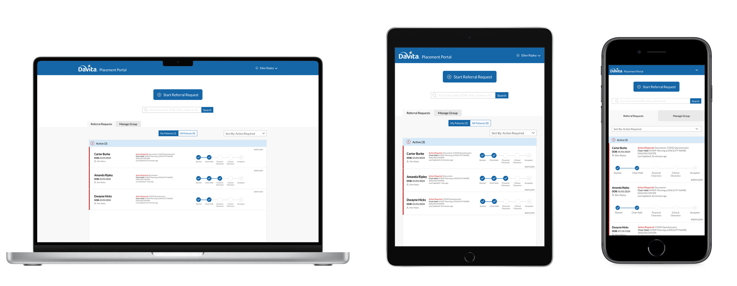
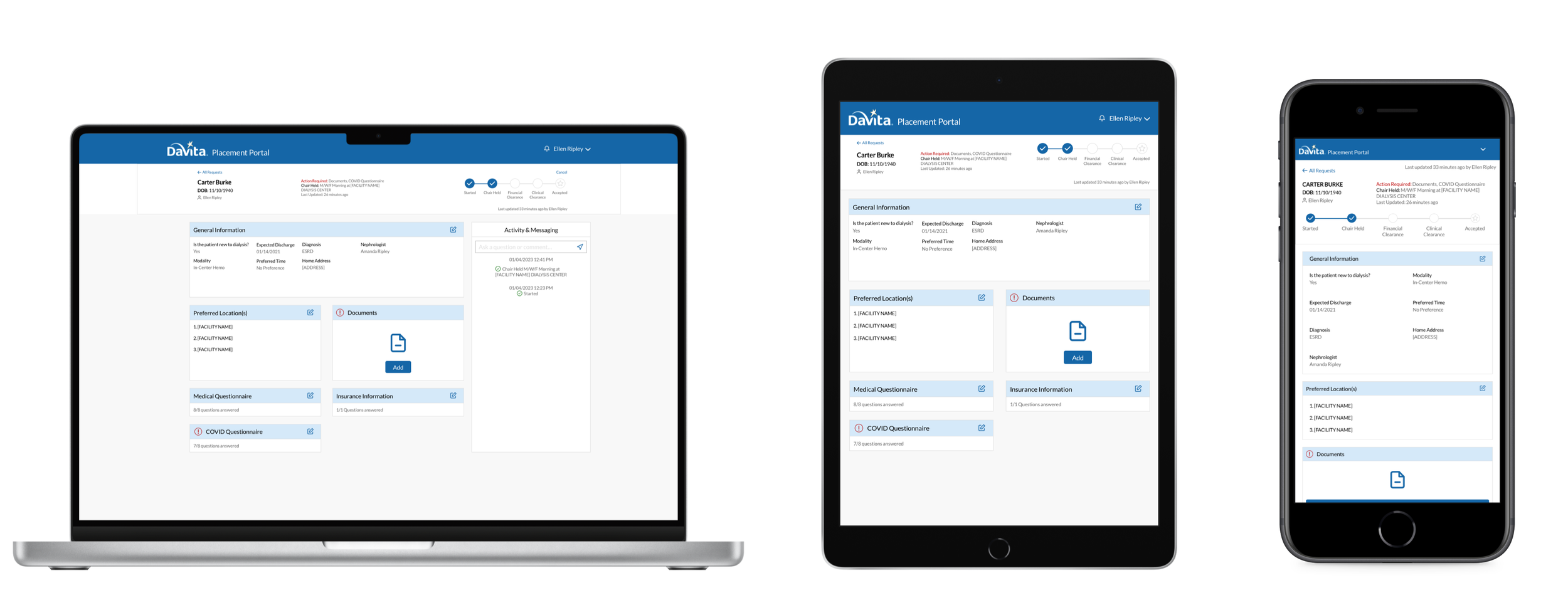
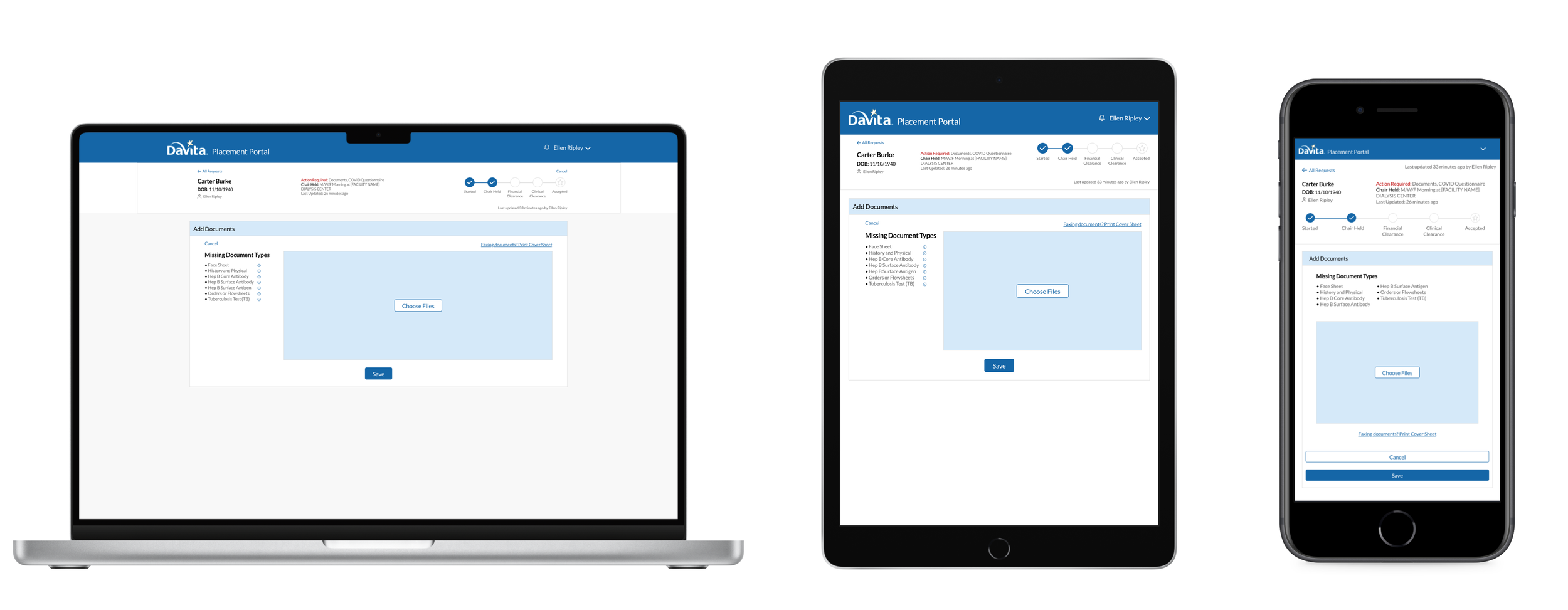
We redesigned the Patient Portal to function seamlessly across desktop, tablet, and mobile devices.
The system:
Adapted complex workflows into responsive layouts
Optimized typography, spacing, and touch targets for smaller screens
Ensured key functionality remained accessible across all device sizes
Reduced friction for users working across multiple environments
Key Tradeoffs
Not all desktop functionality translated effectively to mobile.
Messaging features were removed due to low usage and implementation complexity
Certain interactions were simplified to prioritize usability and performance
These decisions ensured a more focused and efficient mobile experience.
Implementation & Iteration
The redesign required over 170 screens and was delivered in three phases.
Challenges included:
Inconsistent rendering across devices
Limitations of browser-based testing tools
Need for real-device validation
To address this:
A range of physical devices was used for testing
Layout and responsiveness were refined through iterative testing cycles
Outcome
The mobile expansion transformed how teammates interacted with the Patient Portal.
Results:
Enabled full functionality across mobile and tablet devices
Increased flexibility for nurses working across multiple clinics
Reduced dependency on desktop environments
Established responsive design patterns used in future applications
The redesign was well received by stakeholders and became a foundation for future mobile-first initiatives.